Create A New Origami Component - Part 3 Themes & Brands
The “Create A New Origami Component” tutorial is split into nine parts and is intended to be followed sequentially from start to finish:
- Intro & Boilerplate
- Base Styles
- Themes & Brands
- Demos
- JavaScript
- Storybook
- Testing
- Documentation
- Component Lifecycle
In part three we will build on our work in part two by learning how to modify the style of our new component for different contexts.
Component Brands
Origami components are used by products across the Financial Times Group, and some groups require a distinct appearance from others; internal tools have a distinct style from ft.com products for example. To cater for these broad usecases, the appearance of Origami components may be changed within a project by choosing a “brand”:
- core: FT branding for public ft.com sites and affiliates.
- internal: Style suitable for internal products, tools, and documentation.
- whitelabel: Base, structural styles only to build on and customise.
A project chooses a brand globally, meaning all components included in a project must use the same brand. See component brand documentation for examples on how a project may use brands. For reference, when it comes to building branding components, there is also a section on component brands in the specification.
Supported Brands
Origami components may support one or more brand. The brands a component supports are defined along with other component details in origami.json, by the brands property. If brands is not set the component is “unbranded” and implicitly only supports the “core” brand.
When prompted by npm run create-component in part one we select all brands, so the origami.json file of our component should include an array of each brand "brands": ["core","internal","whitelabel"],. If not, update your origami.json now.
Switching Brands In Development
When building a branded Origami component it will generate component assets (HTML, JS, and CSS files) for each brand.
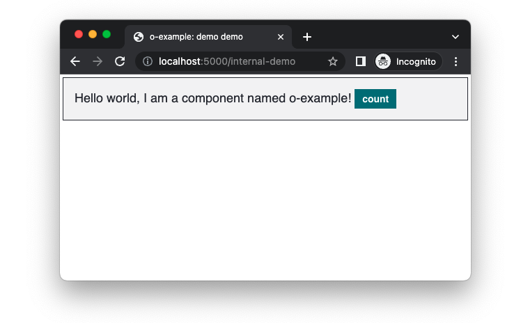
To switch between brands go back to your development URL (e.g localhost:5000) and choose the correct brand HTML file. Alternatively, you can manually change the url end point from /core-demo to /internal-demo.
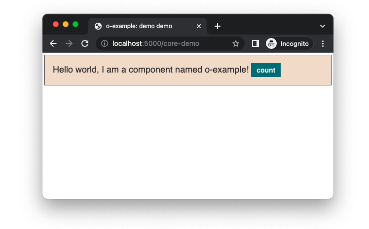
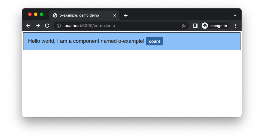
Once the URL is updated you should see in our demo the background colour has changed from a wheat colour to a light slate colour. That’s because wheat is not part of the internal brand colour palette. As we used a colour usecase oColorsByUsecase('box', 'background') in part two, rather than specify a specific colour, it was updated automatically for the internal brand.
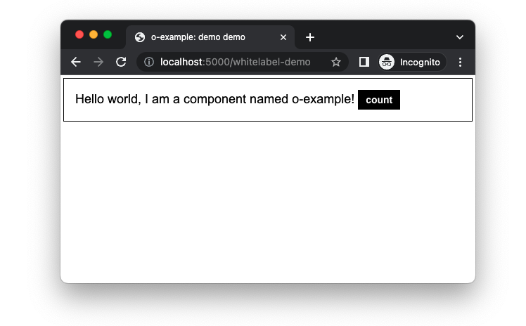
Do the same for the whitelabel brand by changing/choosing the whitelabel-demo.html file from rendered assets. Maybe you already noticed, but if you look at our terminal logs you should see a Sass error Error: 'The color "slate" does not exist.. This error is because we set a border colour by name oColorsByName('slate') in part two, but slate is not in the limited whitelabel colour palette.
To fix this error we need to set the border colour of our component differently depending on which brand is being used.
Configuring Brand Variables
To style our component according to the current brand we need to use o-brand, which create-component has already added as a dependency.
We will use o-brand to define a brand variable border-color in src/scss/_brand.scss, which is where all our brand configuration will go.
You should see in src/scss/_brand.scss two Sass functions which we will discuss later, for now add the following Sass at the bottom of the file.
// src/scss/_brand.scss

@if oBrandIs('core') {
	@include oBrandDefine('o-example', 'core', (
		'variables': (
			'border-color': oColorsByName('slate')
		),
		'supports-variants': ()
	));
}
Lets break down what this is doing.
First, we check if the current brand is the core brand using the o-brand function oBrandIs() and a Sass if statement. We do this to ensure the Sass within the if statement is only evaluated when the brand is the core brand:
// src/scss/_brand.scss

@if oBrandIs('core') {
	//...
}
Second, we call the mixin oBrandDefine, which will let us set component configuration for a given brand. In this case we are configuring our o-example component for the core brand.
// src/scss/_brand.scss

@if oBrandIs('core') {
	@include oBrandDefine('o-example', 'core', (
        // brand configuration for the core brand here..
    ));
}
Third, we pass configuration to oBrandDefine for the brand. We set a brand variable border-color within a variables map, to the value of the slate colour oColorsByName('slate'). We also set a property supports-variants, which we will discuss more shortly.
// src/scss/_brand.scss

@if oBrandIs('core') {
	@include oBrandDefine('o-example', 'core', (
		'variables': (
			'border-color': oColorsByName('slate')
		),
		'supports-variants': ()
	));
}
Now repeat this block for the internal and whitelabel brand, but change border-color to oColorsByName('black') for the whitelabel brand (as slate is not part of the whitelabel colour palette):
// src/scss/_brand.scss

// Add core brand configuration.
@if oBrandIs('core') {
	@include oBrandDefine('o-example', 'core', (
		'variables': (
			'border-color': oColorsByName('slate')
		),
		'supports-variants': ()
	));
}

// Add internal brand configuration.
@if oBrandIs('internal') {
	@include oBrandDefine('o-example', 'internal', (
		'variables': (
			'border-color': oColorsByName('slate')
		),
		'supports-variants': ()
	));
}

// Add whitelabel brand configuration.
@if oBrandIs('whitelabel') {
	@include oBrandDefine('o-example', 'whitelabel', (
		'variables': (
			'border-color': oColorsByName('black')
		),
		'supports-variants': ()
	));
}
Now we have defined border-color for each brand, with a different colour set for the whitelabel brand, we can use border-color within our Sass. Return your focus to the Sass function _oExampleGet at the top of src/scss/_brand.scss:
// src/scss/_brand.scss

/// Helper for `o-brand` function.
/// @access private
@function _oExampleGet($variables, $from: null) {
	@return oBrandGet($component: 'o-example', $variables: $variables, $from: $from);
}
The _oExampleGet function is a component specific function which wraps a o-brand function oBrandGet. oBrandGet is used to retrieve a brand variable depending on the current brand. Wrapping this in _oExampleGet is useful to avoid passing the $component argument repeatedly.
Update main.scss to set our border color with _oExampleGet('border-color'):
// main.scss

.o-example {
		@include oTypographyBody();
-		border: 1px solid oColorsByName('slate');
+		border: 1px solid _oExampleGet('border-color');
		background: oColorsByUsecase('box', 'background');
		padding: oSpacingByName('s4');
		margin: oSpacingByName('s1');
	}
Now if we check our terminal logs again we get a different error! The error is Could not find a colour for the "box" "background" usecase.. That’s because the whitelabel brand does not support the box colour usecase we used to set a background. Unlike the core and internal brand, the whitelabel brand is not opinionated and provides a limited set of colour usescases. Instead of using the usecase lets add a new brand variable background-color so we can support the whitelabel brand as well:
// src/scss/_brand.scss

// Add core brand configuration.
@if oBrandIs('core') {
	@include oBrandDefine('o-example', 'core', (
		'variables': (
			'border-color': oColorsByName('slate'),
+			'background-color': oColorsByName('wheat')
		),
		'supports-variants': ()
	));
}

// Add internal brand configuration.
@if oBrandIs('internal') {
	@include oBrandDefine('o-example', 'internal', (
		'variables': (
			'border-color': oColorsByName('slate'),
+			'background-color': oColorsByName('slate-white-5')
		),
		'supports-variants': ()
	));
}

// Add whitelabel brand configuration.
@if oBrandIs('whitelabel') {
	@include oBrandDefine('o-example', 'whitelabel', (
		'variables': (
			'border-color': oColorsByName('black'),
+			'background-color': oColorsByName('white')
		),
		'supports-variants': ()
	));
}
And update main.scss again:
// main.scss

.o-example {
		@include oTypographyBody();
		border: 1px solid _oExampleGet('border-color');
-		background: oColorsByUsecase('box', 'background');
+		background: _oExampleGet('background-color');
		padding: oSpacingByName('s4');
		margin: oSpacingByName('s1');
	}
Now our component supports all three brands, with a unique appearance for each.

There is more documentation about oBrandGet in the o-brand readme.
You may have noticed we haven’t returned to the supports-variants configuration yet or the _oExampleSupports function. We’ll discuss those next as part of the themes section. If you would like to find out more about o-brand features, see the o-brand readme.
Component Themes
A component may also support themes within a brand, to allow for variations of the component. Further, some components include a Sass interface for users of the component to generate a custom theme.
Unlike brands, which are set at a global level, a project could include many themes of a component at the same time. For example the o-message component has success, neutral and error themes for alerts.
Now let’s add themes to our o-example component. For reference there is a theme section in the component specification.
Our example component will have two themes: an inverse theme that should be used when our component is on a dark background; and a b2c (business to consumer) theme just for the core brand. We will also make our component flexible and allow a user to generate a custom theme.
Theme Mixin
We will add a new mixin called oExampleAddTheme, following the theme convention in the specification, to a new file src/scss/_mixins.scss. Don’t forget to import your new src/scss/_mixins.scss in main.scss, in the same way src/scss/_variables_.scss is imported.
Our oExampleAddTheme mixin will accept a theme name and output a CSS class o-example--[theme-name] which can be added to our component markup to change the theme. The double dash in the theme name is part of the BEM modifier naming convention.
// src/scss/_mixins.scss

@mixin oExampleAddTheme($name) {
	.o-example--#{name} {
		// update border-color and background
		// for the given theme
	}
}
Our mixin oExampleAddTheme uses the $name argument to create a new CSS class .o-example--#{name} (see Sass interpolation). Using them $name variable it is possible to output different CSS conditionally with a Sass if statement. However this would be quite verbose Sass, especially as we need to support multiple themes which might differ in style per brand. Instead we can configure themes per brand where we called oBrandDefine earlier.
Variant Variables
A variant of a component is any visual modification. For example if we were to add a class o-example--big which increased the font size of our component, that would be a variant of o-example. In the same way a theme like o-example--inverse is also a variant.
To define variables for a variant within a brand add a map to the variables configuration of oBrandDefine, where the key is the variant name.
// src/scss/_brand.scss

// Add core brand configuration.
@if oBrandIs('core') {
	@include oBrandDefine('o-example', 'core', (
		'variables': (
			'border-color': oColorsByName('slate'),
			'background-color': oColorsByName('wheat'),
+			'inverse': (
+				'text-color': oColorsByName('white'),
+				'background-color': oColorsByName('slate')
+			),
+			'b2c': (
+				'background-color': oColorsByName('org-b2c-light')
+			)
		),
		'supports-variants': ()
	));
}

// Add internal brand configuration.
@if oBrandIs('internal') {
	@include oBrandDefine('o-example', 'internal', (
		'variables': (
			'border-color': oColorsByName('slate'),
			'background-color': oColorsByName('slate-white-5'),
+			'inverse': (
+				'text-color': oColorsByName('white'),
+				'background-color': oColorsByName('slate')
+			)
		),
		'supports-variants': ()
	));
}

// Add whitelabel brand configuration.
@if oBrandIs('whitelabel') {
	@include oBrandDefine('o-example', 'whitelabel', (
		'variables': (
			'border-color': oColorsByName('black'),
			'background-color': oColorsByName('white'),
+			'inverse': (
+				'text-color': oColorsByName('white'),
+				'background-color': oColorsByName('black')
+			)
		),
		'supports-variants': ()
	));
}
Notice that the background colour we set for the inverse variant is different for the whitelabel brand than the other brands. And the core brand is the only one with b2c variables, as the b2c variant is specific to the core brand.
We can now use the $from argument of our function _oExampleGet to fetch a brand variable from one of our variants. For example _oExampleGet('background-color', $from: 'b2c') will return the org-b2c-light colour when the current brand is the core brand, or null otherwise.
Variant Support
To allow us to check if the theme name given to our oExampleAddTheme mixin is supported by the current brand, add the theme name to the supports-variants list of oBrandDefine configuration. Our final configuration looks like this:
// src/scss/_brand.scss

// Add core brand configuration.
@if oBrandIs('core') {
	@include oBrandDefine('o-example', 'core', (
		'variables': (
			'border-color': oColorsByName('slate'),
			'background-color': oColorsByName('wheat'),
			'inverse': (
				'text-color': oColorsByName('white'),
				'background-color': oColorsByName('slate')
			),
			'b2c': (
				'background-color': oColorsByName('org-b2c-light')
			)
		),
		'supports-variants': (
			'inverse',
			'b2c'
		)
	));
}

// Add internal brand configuration.
@if oBrandIs('internal') {
	@include oBrandDefine('o-example', 'internal', (
		'variables': (
			'border-color': oColorsByName('slate'),
			'background-color': oColorsByName('slate-white-5'),
			'inverse': (
				'text-color': oColorsByName('white'),
				'background-color': oColorsByName('slate')
			)
		),
		'supports-variants': ('inverse')
	));
}

// Add whitelabel brand configuration.
@if oBrandIs('whitelabel') {
	@include oBrandDefine('o-example', 'whitelabel', (
		'variables': (
			'border-color': oColorsByName('black'),
			'background-color': oColorsByName('white'),
			'inverse': (
				'text-color': oColorsByName('white'),
				'background-color': oColorsByName('black')
			)
		),
		'supports-variants': ('inverse')
	));
}
The _oExampleSupports function we briefly mentioned earlier will return true if a given variant name is supported by the current brand, based on the supports-variants configuration we just set. For example only the core brand has the b2c theme listed under supports-variants so _oExampleSupports('b2c') will only return true when the current brand is the core brand.
Output Theme CSS
We can now complete our theme mixin:
- Use
_oExampleSupportswith the Sass@errorat-rule to throw an error if the theme name given is not supported by the current brand. - Use
_oExampleGetto get theme values. - Use
oButtonsContentto update the button styles if there is a matching o-buttons theme.
// src/scss/_mixins.scss

@mixin oExampleAddTheme($name) {
	// Error if an unsupported theme name is given.
	@if not _oExampleSupports($name) {
		@error 'The name "#{$name}" is not a supported "#{oBrandGetCurrentBrand()}" brand theme';
	}

	// Output theme css.
	.o-example--#{$name} {
		background: _oExampleGet('background-color', $from: $theme);
		color: _oExampleGet('text-color', $from: $theme);
		// Theme the o-example button using o-buttons.
		// Only output button styles to change the theme,
		// don't repeat styles shared by all buttons.
		$matching-button-theme: $name == 'inverse' or $name == 'b2c';
		@if $matching-button-theme {
			.o-example__button {
				@include oButtonsContent($opts: (
					'type': 'primary',
					'theme': $name
				), $include-base-styles: false);
			}
		}
	}
}
Now output the themes in the primary mixin oExample. We use the Sass @each at-rule to loop over each theme and call oExampleAddTheme if _oExampleSupports returns true:
// main.scss

@mixin oExample ($opts: ()) {
	.o-example {
		// ... base styles as previously discussed
	}

	.o-example__button {
		// ... button styles as previously discussed
	}

	// call the `oExampleAddTheme` mixin to output css
	// for each theme if the current brand supports it
	@each $name in ('inverse', 'b2c') {
		@if _oExampleSupports($name) {
			@include oExampleAddTheme($name);
		}
	}
}
Currently users of the oExample mixin are forced to output all themes. This will increase the size of users CSS bundle unnecessarily if they are not using them all. We can improve oExample by adding the list of themes to the $opts parameter. Using the $opts parameter means we can output all themes by default but also allow users to choose what themes to output.
// main.scss

@mixin oExample ($opts: (
	'themes': ('inverse', 'b2c')
)) {
	// Get the themes to output from the `$opts` argument.
	// If the user has passed an `$opts` map without a
	// `themes` key, default to an empty list.
	$themes: map-get($opts, 'themes');
	$themes: if($themes, $themes, ());

	.o-example {
		@include oTypographyBody();
		border: 1px solid _oExampleGet('border-color');
		background: _oExampleGet('background-color');
		padding: oSpacingByName('s4');
		margin: oSpacingByName('s1');
	}

	.o-example__button {
		@include oButtonsContent($opts: ('type': 'primary'));
	}

	// Call the `oExampleAddTheme` mixin to output css
	// for each theme if the current brand supports it.
	@each $name in $themes {
		@if _oExampleSupports($name) {
			@include oExampleAddTheme($name);
		}
	}
}
Custom Theme
We can make our o-example component more flexible by allowing users to create their own theme. To achieve that we will add an optional $opts argument to oExampleAddTheme. The $opts argument will accept a map of variables (like those we defined in src/scss/_brand.scss), and pass them to _oExampleGet to create a custom theme. We’ll add support for one new option, button-color, which we will forward to the oButtonsContent mixin, so custom o-example themes can change the colour of the button also.
// src/scss/_mixins.scss

@mixin oExampleAddTheme($name, $opts: null) {
	// Error if an unsupported theme name is given without
	// `$opts` options. If `$opts` are given we are adding
	// a new custom theme.
	@if not $opts and not _oExampleSupports($name) {
		@error 'The name "#{$name}" is not a supported "#{oBrandGetCurrentBrand()}" brand theme';
	}

	// If options are given use them to create a custom theme,
	// otherwise use the predefined variables.
	$theme: if($opts, $opts, $name);

	// Output theme css.
	.o-example--#{$name} {
		background: _oExampleGet('background-color', $from: $theme);
		color: _oExampleGet('text-color', $from: $theme);
		// Theme the o-example button using o-buttons.
		// Only output button styles to change the theme,
		// don't repeat styles shared by all buttons.
		$matching-button-theme: $name == 'inverse' or $name == 'b2c';
		// Theme the button with the `button-color` option if the theme
		// name does not match inverse or b2c, existing o-buttons theme.
		// https://registry.origami.ft.com/components/o-buttons@6.0.14/readme?brand=core#themes
		$custom-button-color: _oExampleGet('button-color', $from: $theme);
		@if $matching-button-theme or $custom-button-color {
			.o-example__button {
				@include oButtonsContent($opts: (
					'type': 'primary',
					'theme': if($matching-button-theme, $name, ('color': $custom-button-color))
				), $include-base-styles: false);
			}
		}
	}
}
From a users point of view, this is how a custom theme will be created using our oExampleAddTheme mixin:
// src/scss/_mixins.scss

// Create a custom theme `.o-example--my-custom-theme`
@include oExampleAddTheme('my-custom-theme', (
	'background-color': oColorsByName('white'),
	'text-color': oColorsByName('crimson'),
	'button-color': oColorsByName('white')
));
Theme Markup
Update your demo markup demos/src/demo.mustache with a theme class to preview what we have done. For example to see the inverse theme update the component class to o-example o-example--inverse:
<!-- demos/src/demo.mustache -->

-<div class="o-example" data-o-component="o-example">
+<div class="o-example o-example--inverse" data-o-component="o-example">
	Hello world, I am a component named o-example!
	<button class="o-example__button">count</button>
</div>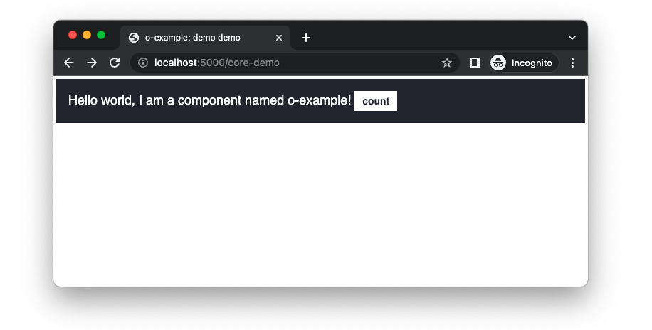
To see the b2c theme, update the component class to o-example o-example--b2c:
<!-- demos/src/demo.mustache -->

-<div class="o-example" data-o-component="o-example">
+<div class="o-example o-example--b2c" data-o-component="o-example">
	Hello world, I am a component named o-example!
	<button class="o-example__button">count</button>
Part Four: Demos
In total we’ve created 7 visual variants of our component across 3 brands and 2 themes, and created a Sass api for users of the component to create custom themes. Many components don’t need to support so many variants but building a complex example has allowed us to explore all aspects of branding and themes.
In summary, in part three we learnt:
- Origami components may offer a distinct appearance for different brands: core, internal, or whitelabel.
- How to use
o-brandto set and retrieve brand variables in Sass. - How to switch brands locally.
- Origami components may be themed within a brand.
- Some components allow custom themes to be created by the user.
Now our component has multiple variants in the way of themes, we need multiple demos to present them to potential users in Storybook. In the next part we will add multiple demos and also look at other demo options in more detail. Continue to part four.