Create A New Origami Component - Part 2 Base Styles
The “Create A New Origami Component” tutorial is split into nine parts and is intended to be followed sequentially from start to finish:
- Intro & Boilerplate
- Base Styles
- Themes & Brands
- Demos
- JavaScript
- Storybook
- Testing
- Documentation
- Component Lifecycle
In part two we will build on our work in part one by learning how to add styles to our new component.
Sass
Origami component styles are written in Sass. According to the Sass Documentation:
Sass is a stylesheet language that’s compiled to CSS. It allows you to use variables, nested rules, mixins, functions, and more, all with a fully CSS-compatible syntax. Sass helps keep large stylesheets well-organized and makes it easy to share design within and across projects.
We won’t cover Sass in depth in this tutorial but will briefly describe the Sass syntax we use. If you’re not familiar with Sass we recommend referencing the Sass documentation.
Components have an entry Sass file main.scss, which may import Sass from the src/scss directory.
Within main.scss you will see something like this:
// main.scss

@import 'src/scss/variables';

/// Output all oExample features
/// @param {Map} $opts [()] - A map of options to configure the output
/// @access public
/// @example scss
///		@include oExample($opts: (
///			// your opts here
///		))
@mixin oExample ($opts: ()) {
	// content of primary mixin
	.o-example {
		display: block;
	}
}
Let’s break this down a little.
Imports
The first line imports Sass from src/scss/_variables.scss. Note the underscore and extension is not needed in the @import statement. All Origami Sass files except main.scss should start with an underscore to indicate they are Sass partials for import and should not be compiled on their own.
// main.scss

@import 'src/scss/variables';
Primary Mixin
Next within main.scss you should see a Sass mixin with the same name as the component, in this case oExample. There are Sass comments which describe the mixin using the SassDoc format. We use SassDoc comments to document Sass in the registry for users of Origami components to reference, and will discuss this in more detail later.
// main.scss

/// Output all oExample features
/// @param {Map} $opts [()] - A map of options to configure the output
/// @access public
/// @example scss
///		@include oExample($opts: (
///			// your opts here
///		))
@mixin oExample ($opts: ()) {
	// content of primary mixin
	.o-example {
		display: block;
	}
}
We call the mixin which shares the component name (oExample) the “primary mixin”. When called with no arguments the primary mixin includes all styles for the component. It will also accept an $opts argument so users may selectively specify which features of a component to include. For example a user of o-forms could pass an $opts argument to the oForms mixin to only output styles for text inputs, if their project does not need other form input types. This helps keep the CSS bundle of the project small.
Naming Conventions
The most important naming convention is prefixing CSS selectors and Sass with the component name. Doing so makes sure a component only applies styles to itself, does not unexpectedly style other parts of a project, and does not clash with Sass from other components.
Other naming conventions to keep in mind include:
- Origami CSS follows the BEM naming convention.
- Sass variables are hyphen separated and lowercase.
- Sass mixins and functions are camel-case.
- An underscore is used to indicate a private Sass interface which may change at any time and must not be used outside the component.
See the Sass naming convention part of the specification for full details and more examples.
Basic Styles
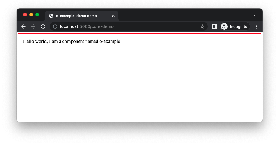
Let’s style our component by adding a border and padding to the .o-example CSS class.
// main.scss

@mixin oExample ($opts: ()) {
	// content of primary mixin
	.o-example {
-		display: block;
+		border: 1px solid red;
+		padding: 1rem;
+		margin: 0.25rem;
	}
}
As the demo uses the primary mixin already, refreshing your demo page will show the new styles (provided the npm run watch -w components/o-example command is still running from part one).

Use Other Component Sass
The styles we’ve added so far use arbitrary colours and spacing (padding/margin) sizes. To improve consistency across projects we can build our component using existing Origami components. To demonstrate lets introduce some existing Origami components to our demo.
First we will update our border colour using o-colors, then we will update our margin/padding to use o-spacing, we’ll style the text content of our component using o-typography, and finally we will add a button using o-buttons.
Install Component Dependencies
The first step is to install each component we want to use via npm:
npm install --save-peer '@financial-times/o-colors@^6.0.0' '@financial-times/o-spacing@^3.0.0' '@financial-times/o-typography@^7.0.0' '@financial-times/o-buttons@^7.0.0'We can now make their Sass available for us to use with @import statements at the top of main.scss.
// main.scss

+@import '@financial-times/o-colors/main';
+@import '@financial-times/o-spacing/main';
+@import '@financial-times/o-typography/main';
+@import '@financial-times/o-buttons/main';
@import 'src/scss/variables';
All @import statements in Origami components should be in main.scss, before any other Sass.
As Origami component Sass does not output CSS by default these imports do nothing except allow us to use Sass mixins, functions, and variables from these components. How to use a component’s Sass is documented in the component readme (see the o-colors readme as an example) and its SassDoc may also be referenced in the component registry (see the o-colors SassDoc as an example).
o-colors
So lets change our red border to the standard slate colour from o-colors using the oColorsByName Sass function.
As well as include a colour by name, we can also get a colour for a specific usecase such as a page background. To demonstrate, set the background colour of our component using the box colour usecase (the box colour is used to highlight an area of content such as an aside).
// main.scss

@mixin oExample ($opts: ()) {
	// content of primary mixin
	.o-example {
-		border: 1px solid red;
+		border: 1px solid oColorsByName('slate');
+		background: oColorsByUsecase('box', 'background');
		padding: 1rem;
		margin: 0.25rem;
	}
}
o-spacing
Then we can use one of the recommended space values from o-spacing using its oSpacingByName Sass function.
// main.scss

@mixin oExample ($opts: ()) {
	// content of primary mixin
	.o-example {
		border: 1px solid oColorsByName('slate');
-		padding: 1rem;
+		padding: oSpacingByName('s4');
-		margin: 0.25rem;
+		margin: oSpacingByName('s1');
	}
}
o-typography
The next thing we wanted to do was style our component text using o-typography. We can do that a number of ways depending on how we want our typography to look. For now let’s use the oTypographyBody mixin. Unlike a function which returns a value, a Sass mixin sets a number of CSS properties; in this case the font family, font size, etc.
// main.scss

@mixin oExample ($opts: ()) {
	// content of primary mixin
	.o-example {
+		@include oTypographyBody();
		border: 1px solid oColorsByName('slate');
		padding: oSpacingByName('s4');
		margin: oSpacingByName('s1');
	}
}
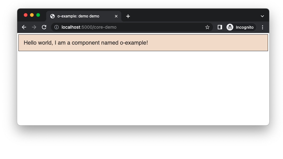
Run npm run watch -w components/o-example, if not already, and preview the component demo as in part one. You should see the styles have been updated

o-buttons
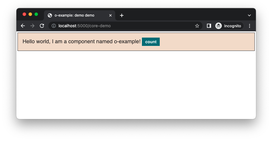
In this tutorial we’re aiming to build a component that includes a button which will count the number of times it was clicked, so next we will add a button to our component.
If we were adding buttons to a project we might include the primary Sass mixin oButtons to output CSS for the buttons we want to use. However the primary mixin will output button classes like .o-buttons and we learnt in a previous section that Origami components must prefix their CSS selectors with the component name. What we want is a class that starts with our component name such as .o-example__button.
Fortunately, o-buttons allows us to output a button with a custom class name using the Sass mixin oButtonsContent. There are a number of options we could pass to oButtonsContent for different types of buttons. We’ll choose a “primary” button type for this tutorial. In main.scss define a new CSS class .o-example__button and include the button CSS with oButtonsContent:
// main.scss
.o-example {
	// [previously discussed css here]
}

.o-example__button {
	@include oButtonsContent($opts: ('type': 'primary'));
}
We need to update our demo markup demos/src/demo.mustache with the new button markup, similar to how we added text to the demo in part one:
<!-- demos/src/demo.mustache -->

<div class="o-example" data-o-component="o-example">
	Hello world, I am a component named o-example!
+	<button class="o-example__button">count</button>
</div>
Note: the double underscore in .o-example__button is part of the BEM naming convention mentioned earlier.

Part Three: Themes And Branding
To style our components we covered many topics in this part of the tutorial. We learnt:
- Origami component CSS is written with Sass.
- Component Sass includes SassDoc comments for Sass documentation.
- Conventional Origami Sass patterns such as the “primary mixin”.
- How to install Origami component dependencies from the public npm registry.
- And finally how to include and use Sass from
o-colors,o-spacing,o-typography, ando-buttons.
Now we know how to add styles, in part three we will build on that knowledge to provide new visual variations of our component. We will add an alternative inverse theme that will modify the appearance of o-example to look better on a dark background. We will also “brand” our component to change its appearance depending on whether it is used within a reader facing ft.com project, internal project, or elsewhere. Continue to part three.