Create A New Origami Component
The “Create A New Origami Component” tutorial is split into nine parts and is intended to be followed sequentially from start to finish:
- Intro & Boilerplate
- Base Styles
- Themes & Brands
- Demos
- JavaScript
- Storybook
- Testing
- Documentation
- Component Lifecycle
Introduction
Usually the Origami team will own an Origami component which is used by multiple teams or groups, but anybody can create and share an Origami component.
In this tutorial we’ll build an Origami component. Our example component will display a “hello world” message and include a button which will count the number of times it was clicked. Visually the component will include multiple variations to suit reader facing (core brand) and internal (internal brand) projects. We’ll also discuss how to document and publish an Origami component so it is visible in Storybook.
Prerequisites
Before you get started, it’s a good idea to discuss your new component with the Origami team first. The team will be able to make sure there’s not an existing component or component proposal that fulfils the same purpose, and will be available to answer any questions.
This tutorial assumes some knowledge. For example we introduce a number of tools and libraries such as git, Sass, storybook, etc. We do not cover these in depth but attempt to include brief descriptions and links to relevant documentation so that you may learn separately about the parts which are new to you.
If you have any questions please contact the Origami team to help make this tutorial better . You can find the team on Slack in #origami-support.
Requirements
There is some software you’ll need on your computer in order to work with this repository.
Node.js & npm
Node.js and npm are required to develop Origami components.
Check the version of Node.js and npm installed on your local machine matches the engines property of package.json.
We recommend using volta to manage which version of Node.js and npm is used on your machine across multiple projects.
git-lfs
To keep the repo speedy, we use git-lfs to store binary files like the images on the website.
brew install git-lfs
git lfs install
entr
entr is used in the component watch command for watching files
brew install entrrg
ripgrep is used in the component watch command for quickly choosing the files to watch for changes.
brew install rgGetting Started
Clone the Origami repository
git clone git@github.com:Financial-Times/origami.git
cd origami
Install dependencies
npm installThis will install all the components into the root node_modules directory, and allow all the components to find one another.
In addition this tutorial introduces a number of tools and libraries such as git, Sass, sinon.js, storybook etc. We do not cover these in depth but attempt to include brief descriptions and links to relevant documentation so that you may learn separately about the parts which are new to you.
The Origami Specification
The Origami Specification is deprecated, new components may diverge from its rules. However, some Origami tools and services continue to depend on parts of the deprecated specification so we will refer to relevant sections of the specification throughout this tutorial. Including for folder structure, code standards, documentation and more.
Boilerplate
To help us get started we can use the following command:
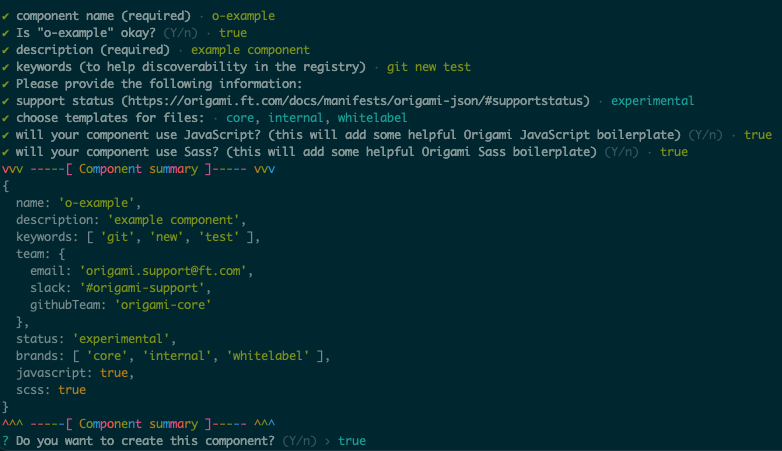
npm run create-componentThe npm run create-component command will ask a number of questions to determine what kind of component we’re building and generate a basic component for us to build from.
Before we run create-component, let’s discuss some of those questions.
Component Name
The first thing we will be asked is to decide a component name. Usually Origami components start with o-, and only contain lowercase letters or hyphens. See the component naming convention for more details.
For this tutorial we will name our component o-example.
Supported Brands
Component brands facilitate component customisation. Brands change the appearance of component elements globally, e.g. change the appearance of all “primary” buttons, including where they are used by other components. Brands include core (think, ft.com pink), internal for internal tools and products, and whitelabel for a striped-back un-opinionated style. Origami components may support one or more brands. We’ll discuss brands more later, for now select the core, internal, and whitelabel brand when prompted by create-component.
Support Status
All Origami components have a support status. For example a maintained component means that “[the component is] not actively developed but reproducible bugs will be fixed promptly and work done where necessary to maintain compatibility with platforms and other projects”; an experimental component means “the [component] is not ready for production use”. For a full list a support statuses and their meaning see the support status section of the specification. It is sometimes a good idea to release a new component as experimental for a trial period to gather feedback from users, so select experimental for now.
As well as a support status, the create-component command will ask for a support email address, slack channel and github team. This will help identify your team as owners of the component. When the component is published a message will display in the component registry letting potential users know that support is not guaranteed by the Origami team, and that they should contact your team before using the component.
JavaScript And Sass
Origami components may include JavaScript for interactivity or Sass for visual styles (we compile Sass to CSS). When prompted, select that you would like the component to include JavaScript and Sass for the purposes of this tutorial. We will use the code it generates as a base to discuss building an Origami component later.
Other Questions
This tutorial won’t expand on other questions asked by the create-component command, like what the component description and keywords are. Please feel free to contact the Origami team if you have any questions during this step.
Output
Now run npm run create-component and answer the questions as above. You should see a directory inside the components folder which contains component boilerplate (commonly shared component code we can build on top of).
The structure of our component now looks something like this. In the next section we will start developing our component, and in the process discuss what is in each directory.
o-example
├── README.md
├── demos
|  └── src
|     ├── demo.js
|     ├── demo.mustache
|     └── demo.scss
├── main.js
├── main.scss
├── origami.json
├── package.json
├── src
|  ├── js
|  |  └── o-example.js
|  ├── scss
|  |  ├── _brand.scss
|  |  └── _variables.scss
|  └── tsx
|     └── o-example.tsx
├── stories
|  ├── o-example.scss
|  └── o-example.stories.tsx
└── test
   ├── helpers
   |  └── fixtures.js
   ├── o-example.test.js
   └── scss
      ├── _main.test.scss
      └── index.test.scss
Start Developing
Now we have a basic component to work from we can start developing!
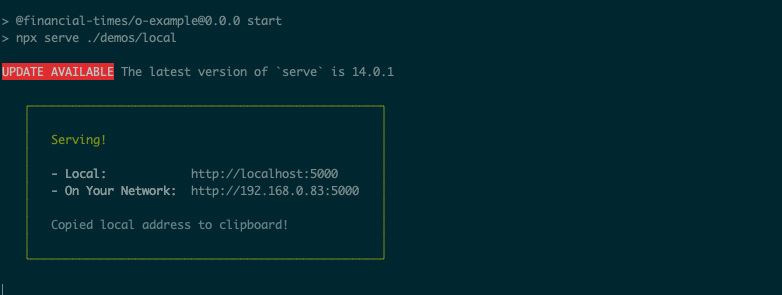
The npm run watch command creates a server for us to preview our component in the browser. And whenever we make any change to the source code the component will be rebuilt, which we will be able to see by refreshing our browser:
npm run watch -w components/o-exampleOpening the link output by the develop command, for example localhost:5000, lists the built component assets in the browser (HTML, JS, and CSS files) for each brand that component supports.
The -w components/o-example flag is used to run the watch command inside the o-example NPM workspaces. If you want to execute a command in a different workspace you can by providing the -w flag and workspace name.
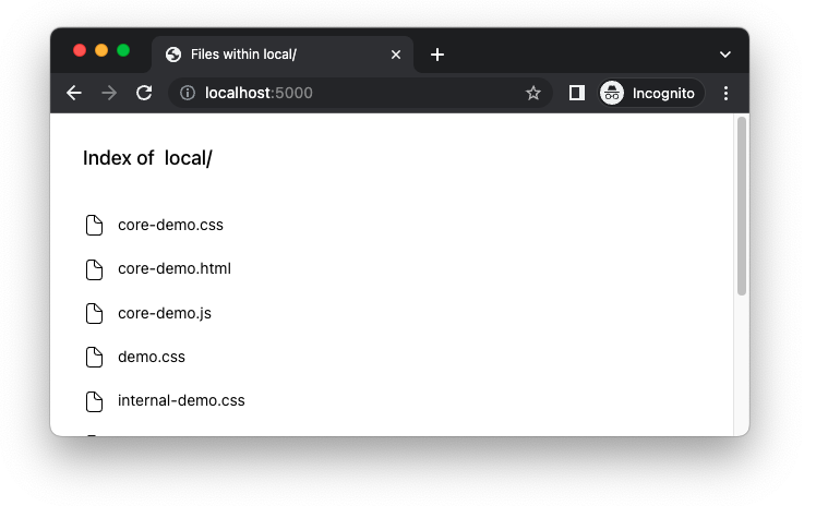
Clicking the HTML file core-demo.html (or other [BRAND]-core-demo.html (or other [BRAND]-demo.html)) will show a blank page. In the next section we will update our component with new HTML and content.
Markup
Origami components are not built to work with any particular framework in mind. This is because product developers may choose to use any technology stack to build their application, and it’s important that they not be forced to choose a particular one in order to use Origami components. With that in mind Origami components are not written in a templating language or a framework but in plain HTML. However some Origami components do provide complimentary TSX templates, which may be used optionally.
Therefore to include component HTML Origami users copy and paste component HTML from the readme README.md, interactive component demos which are presented in Storybook.
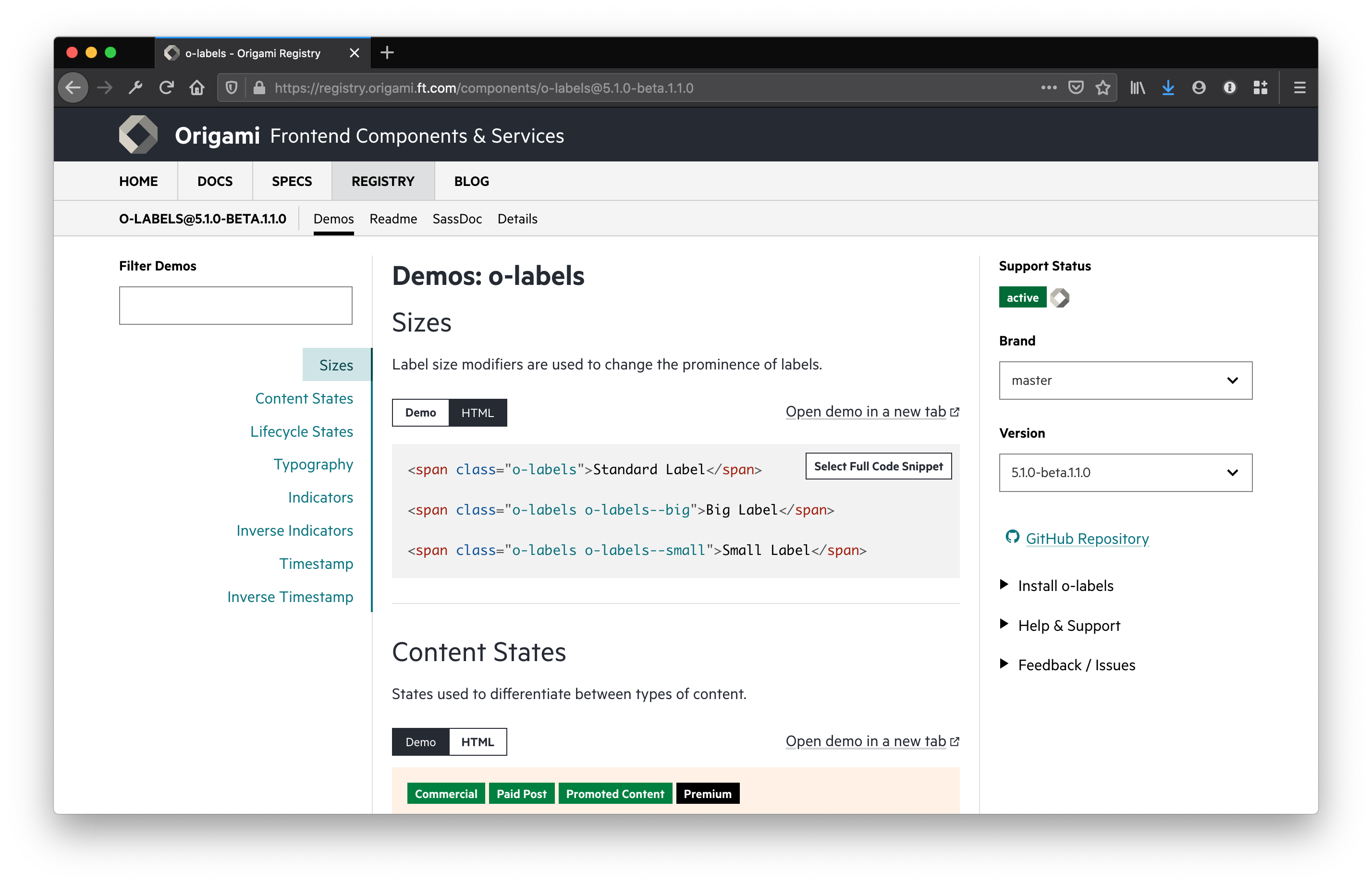
We will use the demos as previews for local development as well as presenting to users in Storybook, where Stories don’t exist for the component.
The templates for demos are in the demos directory and written in mustache. In the demos directory, you should see an example demo demos/src/demo.mustache (we’ll revisit the other files later). Open demos/src/demo.mustache in your editor and you should see something which looks like this (assuming a component name of o-example):
<!-- demos/src/demo.mustache -->

<div class="o-example" data-o-component="o-example"></div>
That div element is our component markup. So we can see something in out demo, add some content within the div.
<!-- demos/src/demo.mustache -->

-<div class="o-example" data-o-component="o-example"></div>
+<div class="o-example" data-o-component="o-example">
+   Hello world, I am a component named o-example!
+</div>
The npm run watch command which we run earlier will detect that you have updated demos/src/demo.mustache and compile it to demos/local/core-demo.html. Now if you refresh your browser you should see the content we just added to the demo.
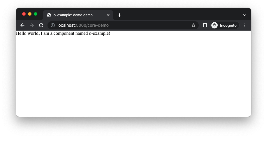
The div tag in our demo may be any HTML tag provided there is a data-o-component attribute. The data-o-component attribute identifies the root of our component and its owned dom. A component may act on a DOM element using JavaScript if the DOM element, or any ancestor, has a data attribute containing the component’s name. There is also a CSS class o-example in our demo. Origami components may only style a DOM element with CSS if it, or any ancestor, has a class which starts with the name of the component. There are more details in the markup section of the component specification but we’ll revisit this when adding CSS styles and JavaScript to our component.
Part Two: Base Styles
In part one we learnt:
- The Origami specification is deprecated, but some sections provide a useful reference to create components compatible with Origami tools and services whilst they are updated.
- Specifically, we learnt about the
npm run create-componentcommand to generate a component to work from when developing a new component. - Origami components are generated inside
componentsdirectory and are stored remotely on Github. - Origami components HTML markup is usually copied by users from origami registry or from storybook demos.
- And finally we learnt how to update the markup in one of those demos.
Now we know how to update our component markup, in part two we will style our component. Continue to part two.