Create A New Origami Component - Part 7 Testing
The “Create A New Origami Component” tutorial is split into nine parts and is intended to be followed sequentially from start to finish:
- Intro & Boilerplate
- Base Styles
- Themes & Brands
- Demos
- JavaScript
- Storybook
- Testing
- Documentation
- Component Lifecycle
In part seven we will add tests to our component. Including tests for Sass, JavaScript, and common accessibility issues.
Run npm run test -w components/o-example to run component tests (you will get some errors but we will fix it in a moment). Run npm run lint -w components/o-example to lint code style and check the validity of origami.json.
Sass Tests
Component Sass tests are run using the Oddbird True library. Sass tests for a component are located in the test/scss directory.
This tutorial won’t cover Oddbird True in detail, for that see the Oddbird True documentation. However to demonstrate we will update the boilerplate test (tests/scss/_main.test.scss) to confirm the oExample mixin outputs CSS for the inverse theme by default:
// tests/scss/_main.test.scss

@include describe('oExample mixins') {
    // tests for the primary mixin oExample
	@include describe('oExample') {
		@include it('outputs the inverse theme by default') {
			@include assert() {
				// output actual CSS
				@include output() {
					@include oExample();
				}
				// expected output CSS to contain
				@include contains() {
					.o-example--inverse {
						background: #262a33;
						color: #ffffff;
					}
				}
			}
		}
	}
}
Again running the npm run test -w components/o-example command should show our new tests have run and passed.
JavaScript Tests
Component JavaScript tests use mocha as a test runner; sinon for stubs, spies, and mocks; and proclaim to make assertions.
To demonstrate how these projects are used to test components we will add a new test to confirm that clicking a button in our component increments the count.
JavaScript tests are located under the test directory. The file example.test.js already has boilerplate tests, which use component markup defined in tests/js/helpers/fixtures.js to confirm the init method works as expected.
Our first step will be to update the htmlCode method in tests/js/helpers/fixtures.js with our latest component markup. We’ll add an id id="element" which we can use in our tests:
// tests/js/helpers/fixtures.js

function htmlCode () {
	const html = `
        <div id="element" class="o-example" data-o-component="o-example">
            Hello world, I am a component named o-example!
            <span class="o-example__counter">
                You have clicked this lovely button <span data-o-example-current-count>0</span> times.
                <button class="o-example__button">count</button>
            <span>
        </div>
	`;
	insert(html);
}
Next we can append our new tests within the main describe("Example", () => {}) block:
// tests/js/example.test.js

describe("with a button", () => {

    beforeEach(() => {
        // Add our component markup to the DOM
        fixtures.htmlCode();
    });

    afterEach(() => {
        // Remove our component markup from the DOM
        fixtures.reset();
    });

    it("should increment the count on click", () => {
        // initialise o-example on fixture markup
        const oExample = Example.init('#element');
        // find and click the button
        const button = document.querySelector('button');
        button.click();
        // confirm the count has incremented
        const actual = oExample.count;
        const expected = 1;
        proclaim.equal(actual, expected, `Expected count to equal ${expected} given a single button click.`);
    });
});
Now run npm run test -w components/o-example. You should see our new tests are run and pass.
Accessibility Tests
npm run test -w components/o-example also runs some accessibility checks. Whilst this will catch some common causes of accessibility issues, such as invalid html or low contrast between text and background, it is not a comprehensive test of component accessibility. For help testing the accessibility of your component see the Origami’s accessibility principles page, or reach out to the Financial Times #accessibility Slack channel.
Visual Regression Tests
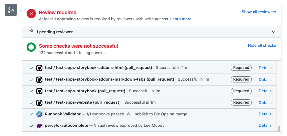
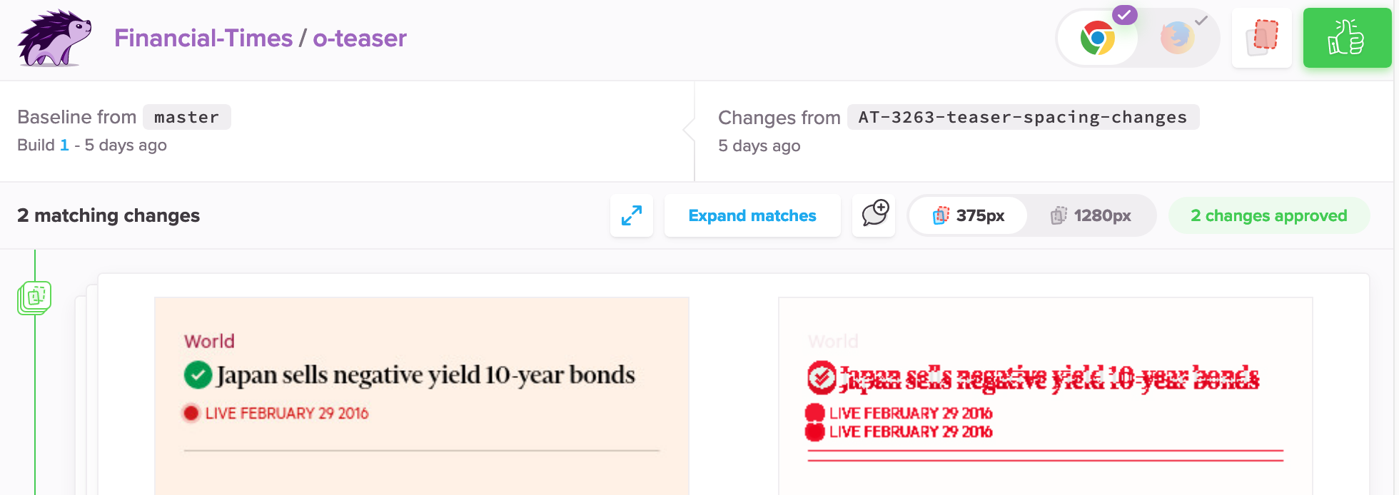
To check all component demos for any visual bugs that may have been introduced accidentally as part of a change may be rather taxing as a manual piece of work. To help, demos may be run through percy.io to highlight visual differences between two versions of a component automatically.
We can’t run Percy yet as we haven’t released a version of our component to compare changes against. But later, when we have released our component, percy.io will run automatically against new pull requests.


Part Seven: Documentation
Our component is working well and is almost complete. In this tutorial we learned:
- That
npm run test -w components/o-exampleruns Sass, JavaScript, and limited accessibility tests. - That
npm run lint -w components/o-exampleanalyses our component for potential errors. - How to write Sass tests for the
npm run test -w components/o-examplecommand. - How to write and run JavaScript tests for the
npm run test -w components/o-examplecommand. - How to highlight visual differences a change has introduced with percy.io.
So far we have missed a crucial part of creating a component: documentation. Without documentation our component will be difficult for users to include in projects and future development may be hindered. In part eight we’ll document our component in a way that is familiar to users and maintainers of other Origami components. Continue to part eight.