Create A New Origami Component - Part 8 Documentation
The “Create A New Origami Component” tutorial is split into nine parts and is intended to be followed sequentially from start to finish:
- Intro & Boilerplate
- Base Styles
- Themes & Brands
- Demos
- JavaScript
- Storybook
- Testing
- Documentation
- Component Lifecycle
In part eight we will add documentation to our component. With good documentation we can save people time and frustration by making our component as easy to use as possible. Thorough documentation will also help future contributors to our new component.
Tone & language
People from various backgrounds across the Financial Times use and contribute to Origami components, so its important to consider communication in documentation carefully.
To help write clear documentation there are Origami tone & language principles. For example we work as a team so use “we” over “I”; for clarity and to express responsibility we use an active voice in component documentation; and as we work with people of different nationalities and backgrounds we avoid metaphors or colloquialisms.
Read more on the tone & language principles page.
Where Components Are Documented
Origami components are documented in four key ways. We have already seen some examples of these:
- The
README.mdfile. - The
origami.jsonmanifest file. - SassDoc comments (for components with Sass).
- JSDoc comments (for components with JavaScript).
- Storybook documentation (for components with Storybook).
Lets review each of these types of documentation for our o-example component.
Readme
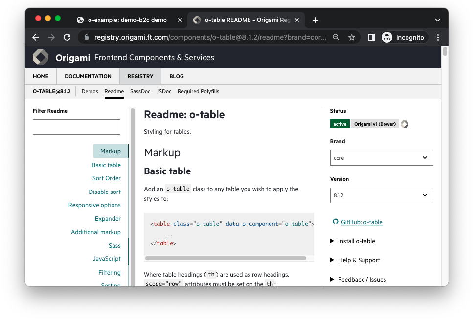
Perhaps the most important part of component documentation is the README.md file, found in the root directory. This is presented in the Origami Registry for each component, for example see the o-table readme.
In our o-example component there is already a README.md with boilerplate content. The readme includes basic component information such as:
- name
- description
- intended usecase
- intended behaviour
The readme goes on to provide technical details of how to use the component:
- Markup - e.g. how to apply themes.
- JavaScript - e.g. what options are available, and how to perform common tasks.
- Sass - e.g. where and why to use Sass mixins
The readme should also contain information about hot to do:
- Troubleshooting
- Contributing
- Migration
And concludes with general information:
- Contact
- Licence
For more complex or novel components there may be additional sections such as for troubleshooting and contributing to the component. Components which have released major changes may also include a migration section which points to a MIGRATION.md file to help users upgrade from one version of a component to the next.
Reference the README.md generated by npm run create-component along with examples from other components to write your own readme. For our component we don’t need any special troubleshooting or contributing guides, so we can delete this section from readme. We also haven’t released multiple major versions yet so can delete the migration guide section for now.

The readme of a component is thorough but risks becoming verbose so Origami components also document Sass and JavaScript apis separately. This allows more detailed api information that the readme can link to. It also provides engineers who are already familiar with a component a reference, to quickly look up an api.
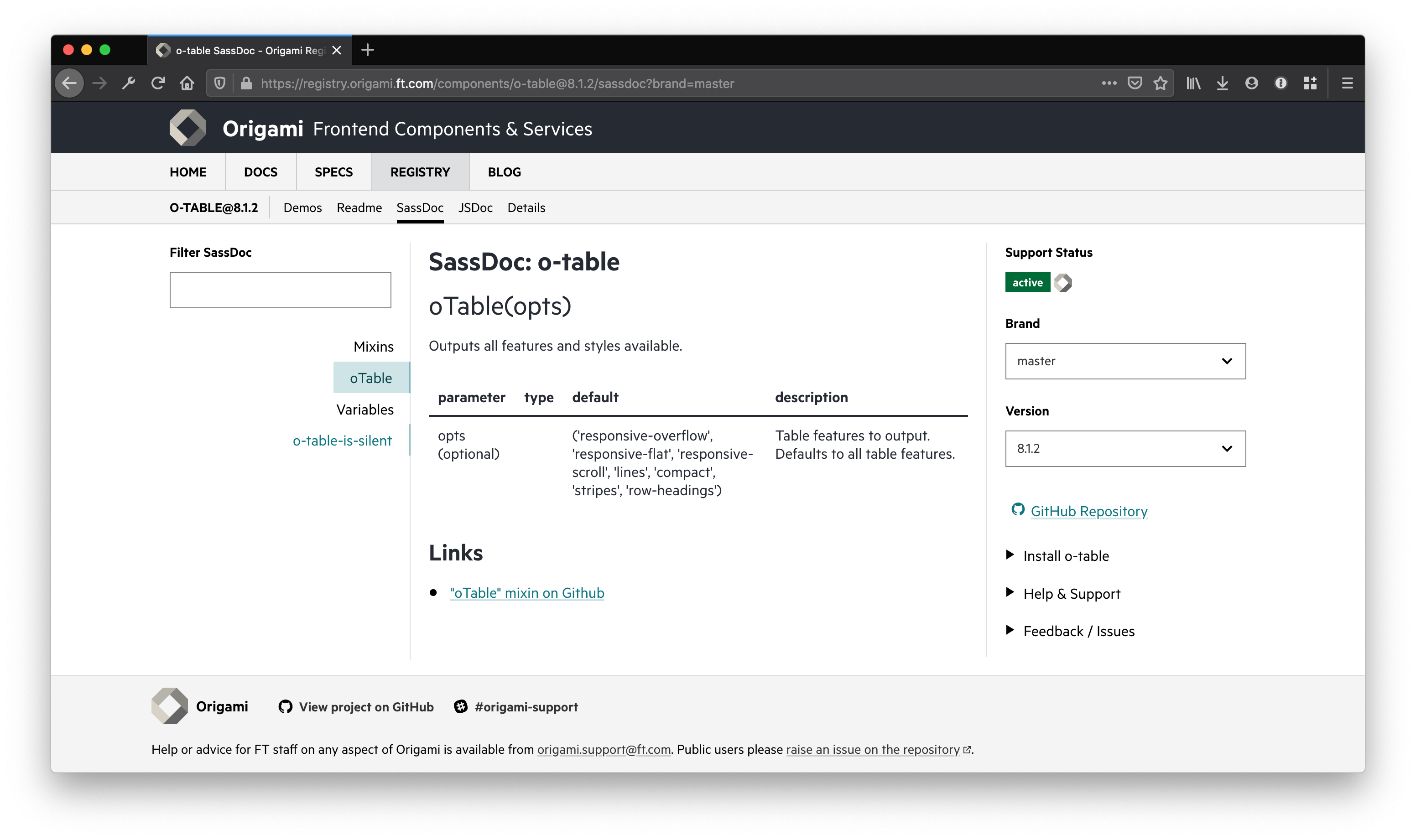
SassDoc
To document Sass functions, mixins, and variables, Origami uses SassDoc. A SassDoc comment comes before the Sass to document. It uses three forward slashes and has a number of annotations. Its easier to see with an example. Let’s add SassDoc comments to our undocumented oExampleAddTheme mixin we created earlier:
// src/scss/_mixins.scss

/// Output a css modifier class for an o-example theme.
/// This may be an existing theme, or a new custom them.
/// @param {String} $name - The name of the theme to output.
/// @param {Map} $opts [null] - A map of theme options to create a custom theme. See the examples and README for full details.
/// @example scss - Output a custom theme modifier class "o-example--my-custom-theme".
///     @include oExampleAddTheme('my-custom-theme', (
///     	'background-color': oColorsByName('white'),
///     	'text-color': oColorsByName('crimson'),
///     	'button-color': oColorsByName('crimson'),
///     ));
/// @example scss - Output a default o-example theme modifier class "o-example--inverse".
///     @include oExampleAddTheme('inverse');
/// @access public
@mixin oExampleAddTheme($name, $opts: null) {
    // theme sass here from before, see part 3
}
Above we give a description of the mixins usecase. We use the @param annotation to document the parameters of our mixin. Note that SassDoc does not provide a way to document each property of the $opts map. Instead we use the @example annotation and readme to compensate. Finally we use the @access annotation to indicate the mixin is public and can be included by component users.

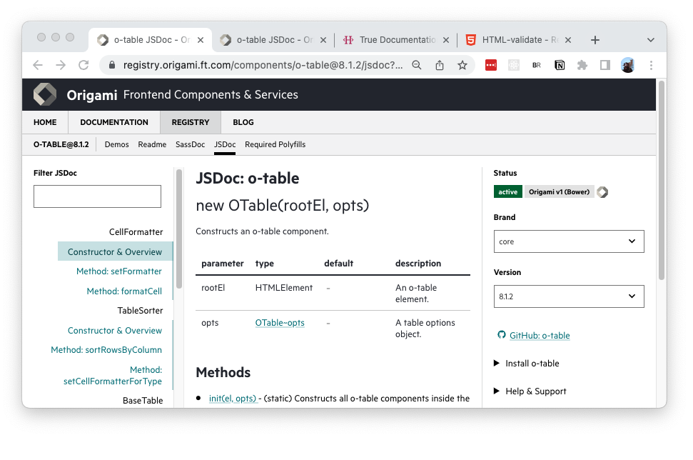
JSDoc
Origami components use JSDoc comments to document JavaScript. For example see the existing JSDoc for the init method of our o-example component, which was generated for us by the npm run create-component command:
// src/js/example.js

/**
 * Initialise o-example component.
 * @param {(HTMLElement|String)} rootElement - The root element to intialise the component in, or a CSS selector for the root element
 * @param {Object} [options={}] - An options object for configuring the component
 */
static init (rootEl, opts) {
	// init js here
}
Similar to SassDoc, JSDoc uses annotations such as @param to document parameters. For more annotations see the JSDoc documentation. As with Sass, the @access annotation may be used but Origami components consider JavaScript methods which begin with an underscore as private, and those without as public.

Origami Manifest
The origami.json manifest file also contributes to the documentation of a component. As we have seen in previous parts of this tutorial origami.json includes a component name, description, keywords, demos, demo descriptions, expected browser features, support contacts, maintenance status, and more information which is displayed in Storybook.
It is important to keep origami.json up to date throughout the lifecycle of the component.
Part Eight: Component Lifecycle
In this part we learnt:
- Component documentation follows tone & language principles.
- What’s in a components readme.
- That we can document Sass apis with Sassdoc.
- That we can document JavaScript apis with JSDoc.
- That we can storybook demos.
- The role of
origami.jsonin documentation.
In the next part we will publish our component and discuss the lifecycle of a published component. Continue to part nine.