Create A New Origami Component - Part 5 JavaScript
The “Create A New Origami Component” tutorial is split into nine parts and is intended to be followed sequentially from start to finish:
- Intro & Boilerplate
- Base Styles
- Themes & Brands
- Demos
- JavaScript
- Storybook
- Testing
- Documentation
- Component Lifecycle
In part five we will add interactivity to our component using JavaScript. For reference, there is a JavaScript part of the component specification which we will be conforming to.
We’ll increment a counter within the component which will update every time the button is clicked. The counter will have an option to display a customisable message after a given count e.g. after 10 clicks display the word “lots” instead.
Initialising Component JavaScript
Our boilerplate JavaScript main.js and /src/js/example has all we need to run (initialise) the component JavaScript and get any options we may want to allow users to configure.
All Origami components provide an init method for running component JavaScript. Notice the JavaScript class for our component and its init method is defined in /src/js/example (where example is the component name without the o- prefix).
By default the init method will initialise any elements on the page which have the data-o-component="o-example" attribute. If a HTMLElement object or valid querySelector expression is given the init method will initialise the element given, or any children, with the data-o-component="o-example" attribute.
main.js has some standard code to automatically run the component’s init method when the o.DOMContentLoaded Origami event is fired (see o-autoinit). It also exports the component so users may alternatively import main.js and directly run init with relevant options for themselves.
For example a user could initialise all o-example elements on the page by including o-autoinit, which will fire the o.DOMContentLoaded event when the page is ready:
// Initialise all elements on the page which have the
// `data-o-component="o-example"` attribute when
// `o-autoinit` fires the `o.DOMContentLoaded` event.
import 'o-autoinit';
import 'o-example';
Or by calling the init method with no arguments:
// Initialise all elements on the page which have the
// `data-o-component="o-example"` attribute.
import oExample from 'o-example';
oExample.init();
Or a user could initialise a specific element, or its child elements, by calling the init method with an argument
// Initialise the `.my-selector` element or any of its children
// which have the `data-o-component="o-example"` attribute.
import oExample from 'o-example';
const myElement = document.querySelector('.my-selector');
oExample.init(myElement);
// Initialise the `.my-selector` element or any of its children
// which have the `data-o-component="o-example"` attribute.
import oExample from 'o-example';
oExample.init('.my-selector');For more details see the JavaScript initialisation section of the Origami specification.
User Configuration
The second init argument is options, an Object of options for the user to configure the component. So users of o-autoinit or the Origami Build Service can also configure components, data attributes may alternatively be used to set component configuration.
In /src/js/example setting component configuration is handled in the constructor. The this.options property is assigned to the given options object, which is merged with any data attributes that have a namespace data-o-example-[option].
For instance the o-table component has a sort feature which may be disabled by either passing {sortable: false} to the o-table init method or by adding the data-o-table-sortable="false" attribute to the o-table element.
We’ll add configuration options later to demonstrate. For full details see the JavaScript configuration section of the Origami specification.
Interactivity
Lets start work on making our example component interactive.
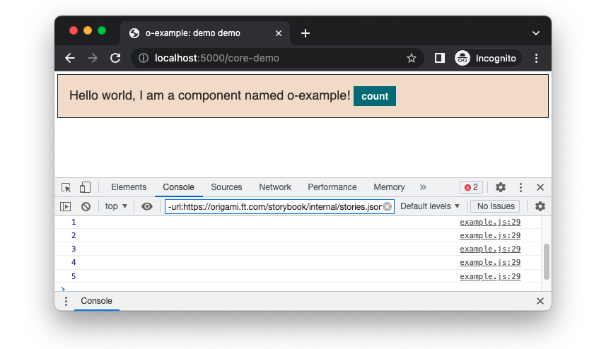
We’ll start by adding a count property, and listen for clicks on o-example buttons using the handleEvent method to increment the count property.
Origami components use browser apis directly for DOM manipulation. For instance Document.querySelector to get an element and HTMLElement.innerText to set an elements text content.
// src/js/example.js

	/**
	 * Class constructor.
	 * @param {HTMLElement} [exampleEl] - The component element in the DOM
	 * @param {Object} [options={}] - An options object for configuring the component
	 */
	constructor (exampleEl, options) {
		this.exampleEl = exampleEl;
		this.options = Object.assign({}, {
		}, options || Example.getDataAttributes(exampleEl));
		// A property to store the current count.
		this.count = 0;
		// Listen to all click events on the o-example instance.
		this.exampleEl.addEventListener('click', this);
	}

	/**
	 * A method to handle event listeners.
	 * https://medium.com/@WebReflection/dom-handleevent-a-cross-platform-standard-since-year-2000-5bf17287fd38
	 * https://dom.spec.whatwg.org/#dom-eventlistener-handleevent
	 * @param {Event} event - The browser event which was triggered.
	 * @returns {void}
	 */
	handleEvent(event) {
		// When any button within the `o-example` component is clicked
		// increment the count.
		if (event.target.tagName === 'BUTTON') {
			this.count++;
			// Log the count temporarily so we can see this working.
			console.log(this.count);
		}
	}
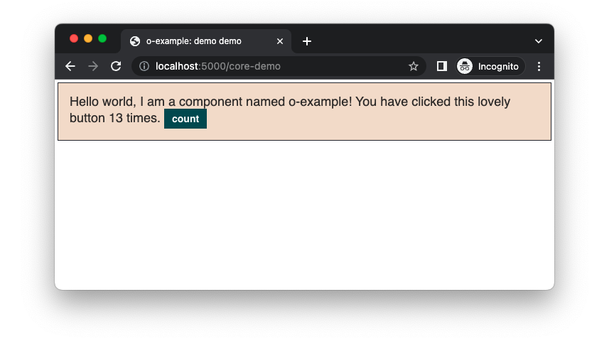
Next we want to update our component to display the current count instead of logging the count to the browsers developer console. One way we could do that is my adding a <span> element to contain the current count and update its text content when the button is clicked. We’ll identify the current count span with a namespaced data attribute data-o-example-current-count.
<!-- demos/src/demo.mustache -->

<div class="o-example {{#theme}}o-example--{{theme}}{{/theme}}" data-o-component="o-example">
-    Hello world, I am a component named o-example!
+    Hello world, I am a component named o-example! You have clicked this lovely button <span data-o-example-current-count>0</span> times.
    <button class="o-example__button">count</button>
</div>
Now in our JavaScript we can get any current count element and update it when our click count is incremented.
// src/js/example.js

handleEvent(event) {
    // When any button within the `o-example` component is clicked
    // increment the count.
    if (event.target.tagName === 'BUTTON') {
        this.count++;
        // Get all the elements within o-example with
        // the attribute data-o-example-current-count.
        const countElements = this.exampleEl.querySelectorAll('[data-o-example-current-count]');
        // For each count element found, update the count.
			for (const element of countElements) {
				element.innerText = this.count;
			}
    }
}
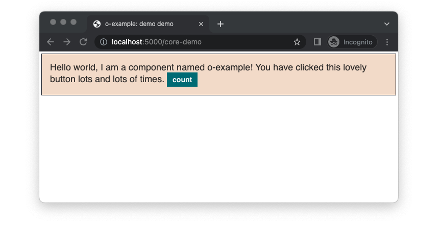
Our example component now displays the click count. In the example above the button has been clicked over 10 times (what fun!) Instead of counting clicks infinitely, we should update the count to display a message “lots and lots of” after a user defined number of clicks.
To do that add an option highCount in the constructor, with a default value of 10:
// src/js/example.js

constructor (exampleEl, options) {
        this.exampleEl = exampleEl;
        // Get the `highCount` option from the `options` argument or
        // from a `data-o-example-high-count` data attribute, or
        // default to `10` if not set.
		this.options = Object.assign({}, {
            highCount: 10
		}, options || Example.getDataAttributes(exampleEl));
		// A property to store the current count.
		this.count = 0;
		// Listen to all click events on the o-example instance.
		this.exampleEl.addEventListener('click', this);
	}
And in the event handler update the counter element with the text “lots and lots of” after the button has been clicked the high count or more:
// src/js/example.js

handleEvent(event) {
    // When any button within the `o-example` component is clicked
    // increment the count.
    if (event.target.tagName === 'BUTTON') {
        this.count++;
        // Get all the elements within o-example with
        // the attribute data-o-example-current-count.
        const countElements = this.exampleEl.querySelectorAll('[data-o-example-current-count]');
        // For each count element found, update the count.
        // If the count is equal to or above the high count display a message instead.
        const countText = this.count < this.options.highCount ?
            this.count :
            'lots and lots of';
        countElements.forEach(e => e.innerText = countText);
    }
}
Browser Support
Core Experience
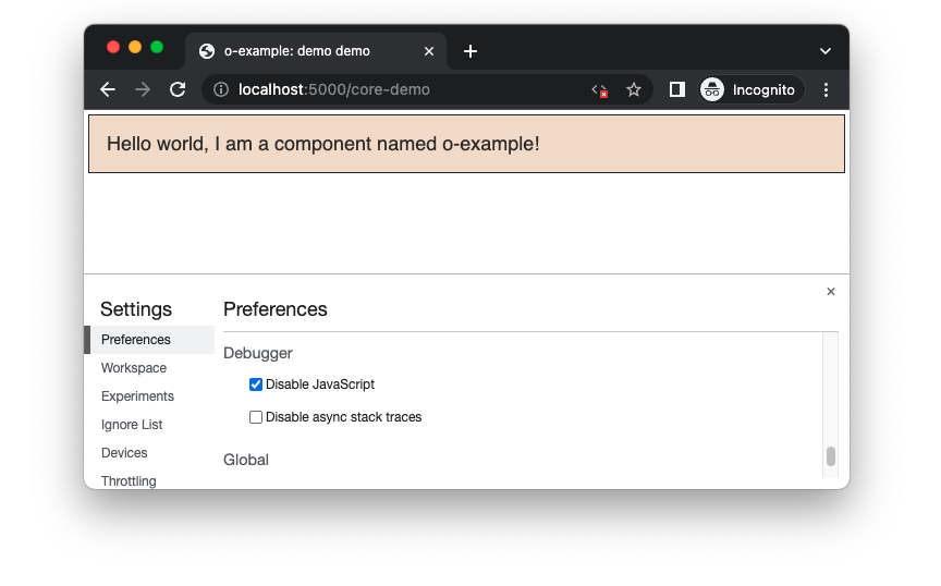
Most projects which use Origami components serve a reduced “core” experience to older browsers, per the Financial Times browser support policy. The core experience at a minimum supports key and fundamental features without JavaScript. Origami components need to maintain these standards as a minimum.
A good component to demonstrate this is o-table. With JavaScript available o-table has client-side sortable columns. When JavaScript is unavailable client side sorting is not possible, and sort buttons are not displayed in table headings. Users without JavaScript have fewer features available but are not left with confusing sort buttons which do nothing, a kind of graceful degradation. o-table also has a responsive variant which allows the table to scroll horizontally on small devices. The scrolling table works for core experience users but is enhanced with JavaScript to include arrows for a more clear indication of when scrolling is possible, a kind of progressive enhancement.
At present our component displays a useless button for core experience users and when JavaScript fails for some other reason. We can update our o-example component to hide the count button for core experience users and only display the message we have written.
So we know when our component JavaScript is initiated successfully lets add a data attribute data-o-example-js to our component as part of the constructor:
// src/js/example.js

constructor (exampleEl, options) {
		this.exampleEl = exampleEl;
		this.options = Object.assign({}, {
		}, options || Example.getDataAttributes(exampleEl));
		// A property to store the current count.
		this.count = 0;
		// Listen to all click events on the o-example instance.
		this.exampleEl.addEventListener('click', this);
+		// Set a data attribute so we know the component is initiated successfully.
+		// The attribute may be used in CSS to style our component conditionally.
+		this.exampleEl.setAttribute('data-o-example-js', '');
	}
Next lets wrap any counter specific part of o-example markup in a span element with the class o-example__counter:
<!-- demos/src/demo.mustache  -->

<div id="element" class="o-example {{#theme}}o-example--{{theme}}{{/theme}}" data-o-component="o-example">
	Hello world, I am a component named o-example!
	<span class="o-example__counter">
		You have clicked this lovely button <span data-o-example-current-count>0</span> times.
		<button class="o-example__button">count</button>
	</span>
</div>
We can then then add CSS to main.scss to hide the counter element o-example__counter until the data attribute data-o-example-js has been added:
// main.scss

@mixin oExample ($opts: (
	'themes': ('inverse', 'b2c')
)) {
	// Get the themes to output from the `$opts` argument.
	// If the user has passed an `$opts` map without a
	// `themes` key, default to an empty list.
	$themes: map-get($opts, 'themes');
	$themes: if($themes, $themes, ());

	.o-example {
		@include oTypographyBody();
		border: 1px solid _oExampleGet('border-color');
		background: _oExampleGet('background-color');
		padding: oSpacingByName('s4');
		margin: oSpacingByName('s1');
	}

+	.o-example__counter {
+		display: none;
+	}
+
+	.o-example[data-o-example-js] .o-example__counter {
+		// Show the counter content when the javascript is initiated
+		// and the data attribute is added to the parent element
+		display: inline;
+	}

	.o-example__button {
		@include oButtonsContent($opts: ('type': 'primary'));
	}

	// Call the `oExampleAddTheme` mixin to output css
	// for each theme if the current brand supports it.
	@each $name in $themes {
		@if _oExampleSupports($name) {
			@include oExampleAddTheme($name);
		}
	}
}
Part Six: Storybook
In part five we learnt how to make our component interactive with JavaScript, covering:
- JavaScript initialisation using the
initmethod. - JavaScript configuration using the
initargument or namespaced data attributes. - How to update the DOM with component JavaScript.
- How to handle no JavaScript at all, to meet Financial Times browser support requirements.
In part six we’ll look at writing storybook templates for our component. Continue to part six.